Making Your Site Mobile-friendly
The first step is actually to MAKE A BACKUP up your site and put it in a safe
place. This tutorial assumes that you have a copy of your site
backed up and stored somewhere away from where you'll be working.
Step One - Add the meta tag to the top of your file
This particular meta tag tells a browser to set the width of the page to the size of the device the visitor is using.
HTML notes
A few notes about HTML:
HTML commands are called TAGS and are always written inside angle brackets, an open < and a close >.
A tag starts with a word or abbreviation inside brackets <font> or <a> (link) and ends with the same item
inside brackets prefaced by a slash </font> or </a>.
Sometimes there are other things inside the opening tag <a href="http://www.somewhere.com/">
Some tags (in old coding) are self closing <br/> (line break) <img/> (image) <hr/> (horizontal rule).
HOW TO
Open your page in a TEXT editor. NotePad works well for this first
simple change if your WYSIWYG doesn't have a SOURCE tab.
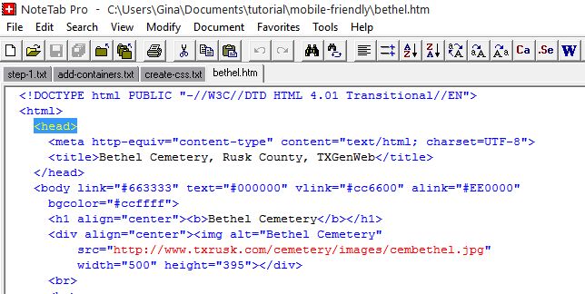 Find <head>
At the top of the page you will see several lines of "stuff".
You're looking for <head>.
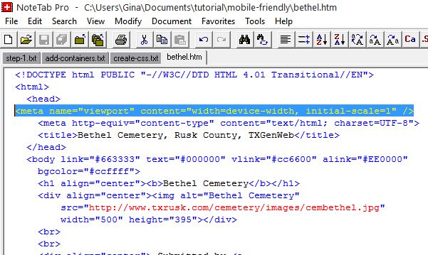 Add Metatag
The line you want to insert is
<meta name="viewport" content="width=device-width, initial-scale=1">
Insert it just after <head>.
Save the file and upload it.
Go to Step 2 - Create CSS File