Basic CSS Tutorial
Page Borders
Now that you've learned about borders, you might want to add a border around your page. I do add borders on most of my sites but I usually add a box around my content and add the border to that instead. You can try it both ways. To add a border to the page,go back up to your body section in the css file and paste that border in and then change the width from thin to 10px.
Notice that the border stops at the bottom of your content, because that's where your page stops. While block containers go all the way across the page, they're only as tall as the tallest item inside them. That's why I prefer to add a box around my content and add the border to it. Then I can set the background of my page to the same color and have a short page or pretend that the blank space is just more decoration (ah, laziness).
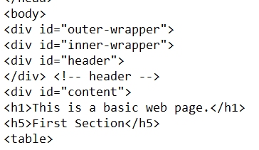
To add a box, go to the top of your page and find the <body> tag. Add a line just under it and type (or paste)
<div id="outer-wrapper">.
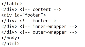
Go down to the bottom of your page and find </body> and add a line just above it and type </div>. I like to go one step further and use
</div> <!-- outer-wrapper -->. This tells me what that closing tag is for and comes in handy if I have 5 or 6 of them down there. The exclamation point and dashes make it a COMMENT line that isn't visible on your page. Scroll down to the bottom of this page for a view of our final set up.
Now we'll format it in the CSS file. Remember that this is an ID, not a CLASS so it starts with a # and you want to insert it into your file in alphabetical order (before table).
#outer-wrapper {
width: 90%;
border: 6px double red;
}
Refresh your browser and have a look. We'll get into how to center this box a little later.
We added a very narrow padding to our page but now this border is INSIDE that padding and my h5 is up against the border so I want to add some padding to the wrapper.
#outer-wrapper {
width: 90%;
border: 6px double red;
padding: 1em;
}
Now there's a nice white buffer between both my h5 and table and my border.
NOTE: Some borders (including this one) have a minimum width required. If you try to make this border too narrow, you won't get the separation and it'll look like one thick border. The groove, inset, outset and ridge also require a little extra width to make them look 3D - another good experiment project.
I like to get really fancy sometimes so I also use an #inner-wrapper. I ALWAYS add these to my pages. I may not use them but they're there if I want them when I redecorate. Add the
<div id="inner-wrapper">immediately UNDER the outer wrapper on your page and put its
</div> <!-- inner-wrapper --> immediately ABOVE the one for the outer wrapper - like putting a box into a bit larger box and it's called nesting.
 Add a few more boxes...
Immediately under the inner wrapper on your page, add <div id="header">
and immediately below it put its </div> <!-- header -->
Under that one, add <div id="content"> and put its closer at the bottom immediately ABOVE the one for the inner wrapper.
</div> <!-- content -->
Now our headings and our table are all inside the content part of our page. The other good thing about using the content box is that the actual page content (as opposed to header and footer) is easy to find and copy.
ONE MORE. We need a footer. It's a good place to add our copyright, email address, search engine, last update, or anything else that is needed on every page.
Just UNDER the CLOSER for the CONTENT, add <div id="footer"> and put its closer on the line after it.
</div> <!-- footer -->.
 If you want a really busy page, you can create a border for each of these boxes and add a background color. Each one can
have a different border and different background. You can also use the background image statement from the body section
if you want a background image in every box. This is where you set a white or very pastel color on your CONTENT box so that you
have a place to put legible text. (And now you can add a background image to the page - from lesson 5.)
How my page looks now.
Previous Next